Tuesday 31 January 2012

A TTC morning visualized through data

I was late for class today. Something was up at Osgoode station, with reports of smoke at track level. Ever wondered what that means? I'm looking into it.

But I've got something more interesting to talk about.

Toronto programmer James Fisher was wondering what can be done with all the data the City of Toronto publishes. Through its open data initiative, anyone can get an astronomical amount about our public services.

Fisher took data from the buses and streetcars serving the city for six hours one Friday morning.

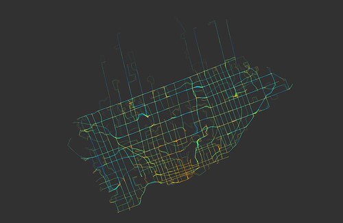
An capture of six hours of TTC buses and streetcars.
Courtesy of James Fisher himself,
found on Flickr as indexity.
He took the data and visualized it, producing a minute-long video that speeds through the first hour of the morning rush. More than 1,500 routes are seen circling

It's worth having a watch. It's interesting and even enchanting to have a look as the city awakes.

But the most important part, for me, is that routes are colour-coded by speed. You can see which ones are moving slower, and even which areas are underserved.

This is the kind of project I'm hoping to take on. I'm in touch with TTC communications, and I'm hoping to visualize some of the delays on a map by colour-coding them. This way we can tell which areas suffer the most delays and which routes are the worst to take.

Fisher's project attracted some media attention, though this isn't his first time visualizing TTC data.

Seven months ago, Fisher took a day of streetcar traffic and made it into a 90-second video. The dots are coloured by route, not speed, and there's something magical about it. Have a look:


TTC Streetcars from James Fisher on Vimeo.

Tuesday 24 January 2012

Torontonians' love-hate relationship with the TTC: it's complicated

Something to do while waiting for your bus.
(Courtesy of Flickr user Kid Vincent)
Assembling a list of related sites, I came to realize how deeply Torontonians love and hate the TTC.

They've taken these emotions to the Internet, in the hopes of improving the relationship.

Torontonians have made a handful of apps that use GPS to indicate the next bus or streetcar. Citizens created a route planner before the TTC launched one.

One blogger even attempted the very idea of this blog (and chose a better username) last summer. There’s a slew of similar projects listed on the right-hand panel of this blog.

In 2010, one councilor led a citizen-run audit of the entire subway and RT system station-by-station. I’m looking into what came of it.

For Torontonians, transit is more than just getting from point A to B. Streetcars are a symbol of the city, and griping over delays is a social institution. The Toronto Star launched a multimedia project last month exploring how the Queen St. line covers most of the city, and not just physically.

Our relationship with the TTC can even get quirky. One site publishes a subway efficiency guide, a pocket-sized printout that tells you which carriage and door gets you closest to the exits. The site also explains those orange and green platform dots, and how to game the streetcar system.

And while we wait for relief lines, integrated networks and express routes, subway fans have becoming imaginative. One compilation shows over a dozen fantasy maps that will delight, inspire and confuse you.

My favourite map is below, complete with a circling line and stops at Pearson airport and the zoo. But I’ll admit that Scarborough, like always, is shafted.

Click to enlarge, prepare to be amazed.

Tuesday 17 January 2012

Toronto has Canada's longest commute times


TTC delays: frustrating but common.
(Courtesy of Flickr user jaygoldman)

Last August, a Statistics Canada report once again placed Toronto as the country's worst region for commuting times. As the Toronto Star reported, public transit commutes took on average 20 more minutes than driving in 2010.


Part of the problem is delays. Accidents and mechanical issues cause scores of service interruptions each week. But these issue are made worse by budget constraints and inefficiencies.

It's an issue Torontonians care about.

The TTC announces delays to an email list and through its own Twitter account, though an unaffiliated account aggregates the tweets of frustrated commuters.

Local app developpers have created tools to make commutes more bearable, like Rocket Radar, an app that uses GPS tracking to give a real-time countdown of when buses and streetcars are arriving.

As I was writing this post, trains were turning back between Sherbourne and Castle Frank in the middle of rush hour. Stay tuned.